
Designing desktop apps for cross-platform UX
Designing and converting web apps into desktop apps can be challenging because of the different conventions between the two platforms. While infrastructure tools like ToDesktop can handle much of the heavy lifting, specific differences can only be addressed through client-side code and consideration.
To help elevate the user experience, we've compiled a list of guidelines to consider when using cross-platform technologies like Electron and Tauri to build for the desktop. We have also provided relevant links to our documentation, offering shortcuts to implementation when relevant.
Iconography
When designing application and tray icons, aligning them with platform conventions is essential. Here are some shared macOS, Windows, and Linux tips to follow:
- Maintain a visual style consistent with other icons on the platform.
- Align the icon's primary content in the center of an invisible grid (See this template for example).
- Avoid using text or small details that are difficult to see in smaller sizes.
On the topic of size, each platform also has its preferred icon sizes. For example, macOS icons are often larger to account for retina displays. Refer to the following table for the recommended icon sizes:
| Platform | Application Icon Size | Tray Icon Size |
|---|---|---|
| Mac | 1024x1024 pixels | 44x44 pixels |
| Windows | 256x256 pixels | 32x32 pixels |
| Linux | 512x512 pixels | 24x24 pixels |
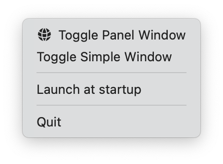
Lastly, macOS tray and menu icons should adjust colors according to the user's theme. You can achieve this by providing a transparent file with a black and alpha channel. This will give you the following effects when a user switches between modes:
| Light Mode | Dark Mode |
|---|---|
 |
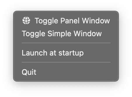 |
For more, refer to our documentation on application icons, tray icons, and menu icons.
Notifications
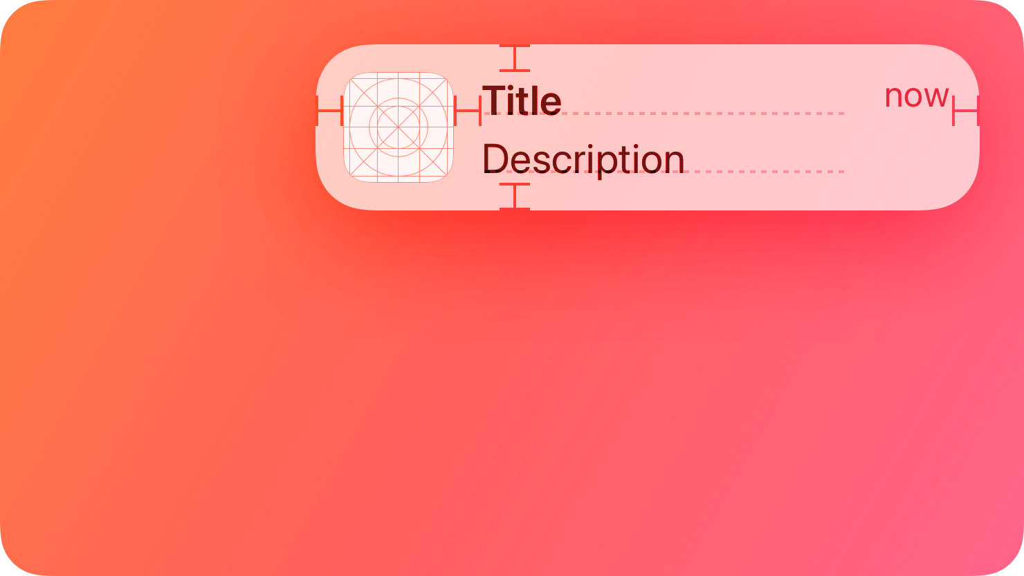
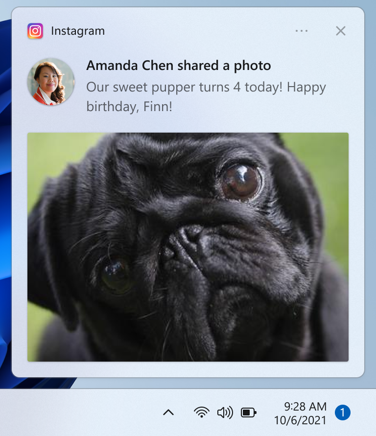
Sending native notifications on desktop apps requires user permissions, similar to notifications on the web. To ensure a good user experience, here are some things to avoid on both macOS and Windows:
- Avoid sending notifications that instruct users to perform specific tasks within your app. Instead, provide notification actions in these situations.
- Avoid using notifications to display error messages. Use alerts for this purpose.
- Avoid including sensitive information in notifications, as the context in which users receive notifications can vary.
| macOS | Windows |
|---|---|
 |
 |
For ToDesktop users, you can continue using the HTML5 Notifications API. We will intercept the notification and send an OS notification to your users. Learn more about sending notifications in our documentation.
Window rendering
Rendering the app window in a desktop application usually involves two steps: creating the native desktop window and creating the corresponding view that renders your app. To ensure a seamless visual experience, follow these suggestions:
- Ensure that the background color of the native window matches the background color of your rendered application. This avoids the flickering effects when the application's background color overrides the default window background color.
- Consider delaying the window's visibility until its contents have finished rendering. This provides a better user experience, though it results in a longer initial window loading time.
Learn more about changing the window background color and controlling launch visibility in our documentation.
Window restoration
When possible, desktop apps should remember the last-used desktop workspace, window size, and coordinate positions. This allows your application to re-open its windows with its previous context when the application is entirely quit and later restored.
To achieve this, refer to our documentation on remembering window state.
Vibrancy (macOS only)
Vibrancy is a visual effect that changes how a window appears when placed on top of other content. It provides a beautiful color passthrough for applications with transparency. Implementing vibrancy in your macOS desktop application helps it blend seamlessly with other native apps.
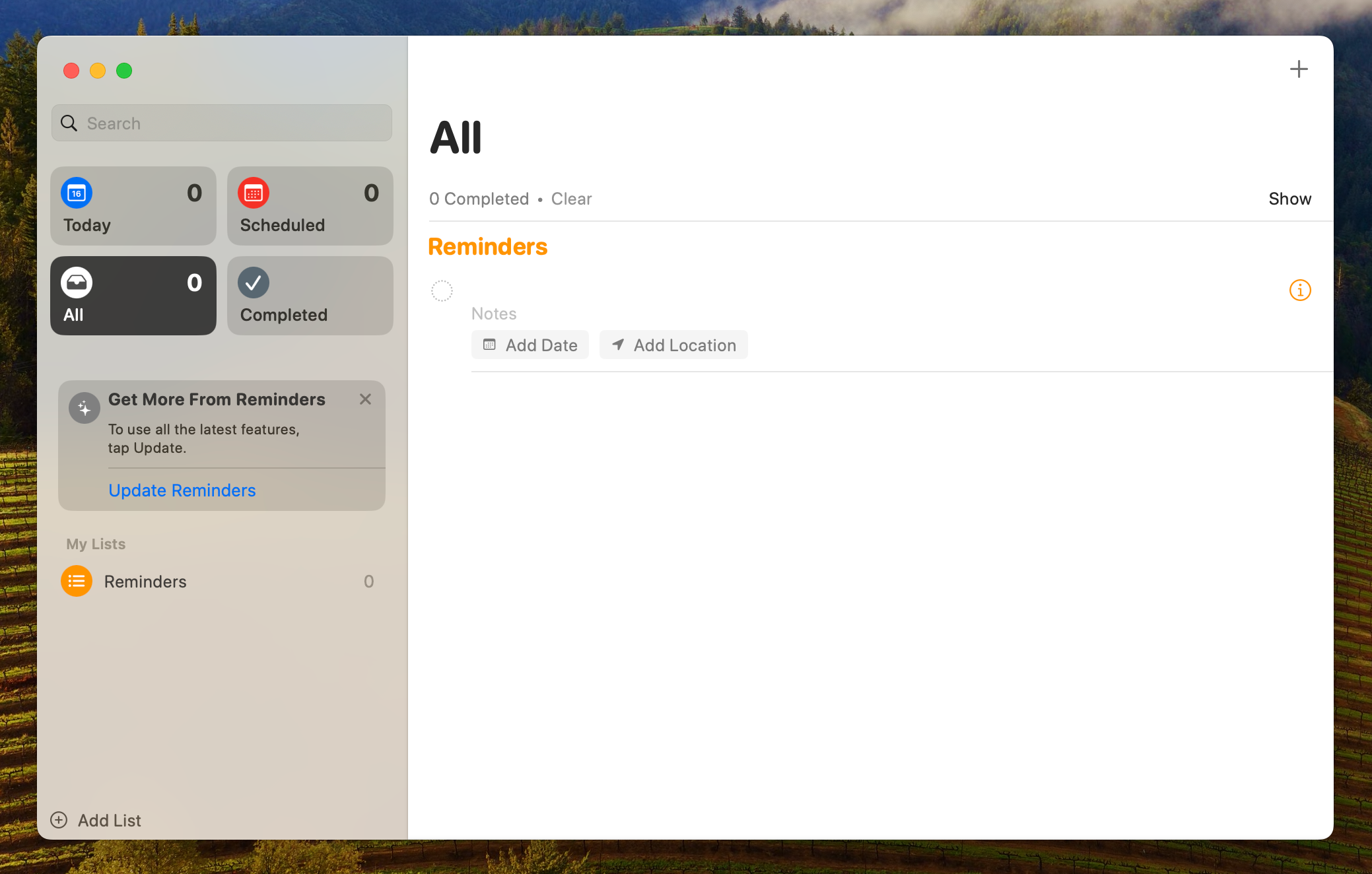
When implementing, ensure that your application's CSS allows for some transparency. For example, you can allow for colour to pass through your sidebar by using background colours that support alpha channels:
.sidebar {
  background-color: rgba(255, 255, 255, 0.5);
}
Refer to our documentation to learn more.
Multiple window support
Many native apps take advantage of multiple desktop windows. The following are popular combinations:
- A main application window with a secondary menubar window for displaying summary information.
- A main application window with a secondary keyboard-accessible panel window for quickly entering data.
You can also consider allowing your main window to be duplicated if it suits your application. However, note that not all apps need to support multiple windows and so this should be implemented on a case-by-case basis.
You can learn more about creating multiple windows with ToDesktop.
Title bar rendering
On most operating systems, you can customize the application title bar. For example, you can tweak or even replace the existing title bar on Windows. More modern applications, however, often remove the visual overhead of the title bar completely:

Removing the title bar requires overlaying the window controls directly on your app. Platforms do this automatically, but your application needs to add some artificial padding to create a space for these window controls to occupy.
Also, make your application's header draggable so that users can still drag and move the window as required. You can achieve this through the following CSS:
.header {
  -webkit-app-region: drag;
}
Refer to our transparent title bars documentation for more details.
Context menus
Context menus, triggered by right-clicking the UI, offer quick actions relevant to the selected element in desktop apps. When utilizing context menus, consider the following guidelines:
- Include a small number of contextually relevant menu items.
- Keep submenus one level deep if you deem them necessary.
- List menu items that delete data at the bottom of the menu.
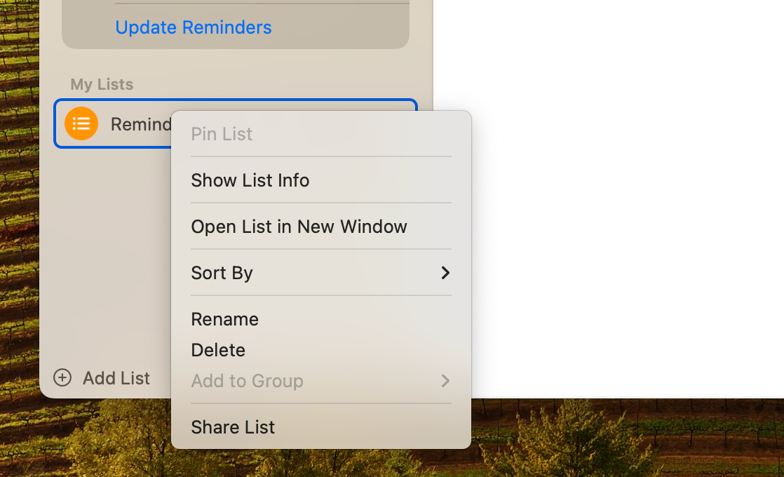
Learn more about creating context menus in our documentation.
Native UI behaviour
Unlike web applications, native desktop apps have different behaviours when it comes to the UI.
For example, native desktop apps limit text selection to certain elements, such as input fields, that can be copied and pasted. This behaviour can be replicated by enabling the user-select CSS property:
html {
  user-select: none;
  -webkit-user-select: none;
}
By default, text selection is disabled for all elements except those explicitly allowed. To re-enable text selection selectively, use the following CSS:
.custom-element {
  user-select: auto;
  -webkit-user-select: auto;
}
Another difference concerns cursor behaviour. In web apps, the cursor pointer gesture is often used for all clickable elements, while in desktop apps, it's reserved for links and implies certain browser interactions, e.g. clicking a link from a desktop app should open a new tab in your default browser. To implement this behaviour correctly on desktop, you can use the following CSS
html,
html.div {
  cursor: default;
}

a {
  cursor: pointer;
}
To learn more about how we support native UI behaviours in ToDesktop, visit our guides on adding custom code and implementing native text selection.
Theme consistency
While it's generally good to respect a user's theme preferences, it's even more crucial for desktop apps, as a user's theme will also affect the application's window frame style.
Fortunately, CSS provides a prefers-color-scheme media feature which allows us to detect if a user is using dark or light color themes based on their system settings:
@media (prefers-color-scheme: dark) {
  body {
    background-color: black;
  }
}

@media (prefers-color-scheme: light) {
  body {
    background-color: white;
  }
}
While a user can specify theme settings at an operating system level, there are situations where they may want to override this choice for specific apps. In these situations, changing the theme at the window level is essential.
How this can be achieved is particular to the underlying platform, but ToDesktop's API provides a simple utility for changing the underlying theme of the application's windows:
import { nativeTheme, platform } from "@todesktop/client-core";

async function overrideTheme(isDarkMode) {
  // change theme mode as normal
  document.body.classList.toggle("dark", isDarkMode);
  document.body.classList.toggle("light", !isDarkMode);

  // if within a desktop app, also change the native theme for the window
  await nativeTheme.setThemeSource(isDarkMode ? "dark" : "light");
}
Visit our guide on reacting to operating system theme preferences to learn more.
System fonts
Different platforms come with many preinstalled fonts that your application's UI can use. For reasonable defaults, we recommend the following cross-browser stacks (as recommended by Tailwind):
| Type | Stack |
|---|---|
| Sans | ui-sans-serif, system-ui, -apple-system, BlinkMacSystemFont, "Segoe UI", Roboto, "Helvetica Neue", Arial, "Noto Sans", sans-serif, "Apple Color Emoji", "Segoe UI Emoji", "Segoe UI Symbol", "Noto Color Emoji" |
| Serif | ui-serif, Georgia, Cambria, "Times New Roman", Times, serif; |
| Mono | ui-monospace, SFMono-Regular, Menlo, Monaco, Consolas, "Liberation Mono", "Courier New", monospace |
While these defaults are excellent for providing a consistent experience across platforms, using a particular font stack on specific platforms is sometimes preferable. For example, it may be better for Mac device fonts to load instead with a priority of -apple-system, ui-sans-serif, system-ui....
Once again, ToDesktop provides a convenient way to apply platform-specific styles with the class selectors that it injects into the HTML markup of your page. You can learn more about this here, but here's a preview of what it looks like:
/* handles mac, windows, and linux distros */
html.todesktop {
  font-family: ui-sans-serif, system-ui, -apple-system, BlinkMacSystemFont, "Segoe UI",
    Roboto, "Helvetica Neue", Arial, "Noto Sans", sans-serif, "Apple Color Emoji",
    "Segoe UI Emoji", "Segoe UI Symbol", "Noto Color Emoji";
}

/* override mac handling */
html.todesktop-platform-darwin {
  font-family: -apple-system, ui-sans-serif, system-ui, BlinkMacSystemFont,
    "Segoe UI", Roboto, "Helvetica Neue", Arial, "Noto Sans", sans-serif,
    "Apple Color Emoji", "Segoe UI Emoji", "Segoe UI Symbol", "Noto Color Emoji";
}

/* override windows handling */
html.todesktop-platform-win32 {
  /* ... */
}

